Thursday, 27 September 2012

Dreaming in Infrared

Have you ever seen (near-) infrared photographs?
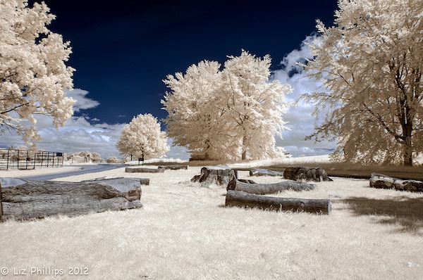
It’s like looking into someone else’s dream! So quiet and eerily tranquil, you can only whisper in this strange world.
One way to capture images like these is to convert your regular digital cameras to do so, because they are inherently capable of detecting infrared. In fact, their sensors are so sensitive to infrared that manufacturers have to insert a blocker so that normal photography will not be interfered. Essentially, the conversion replaces that blocker with a filter that does the exact opposite: only lets in infrared and blocks out all other lights.
I was up for a little convert-it-yourself. First, I managed to get a used Nikon D70 on Craigslist at a bargain price. The seller was a photographer upgrading her equipment. Plus, the D70 is supposedly one of the simplest cameras to convert. Then carefully, I followed the conversion steps outlined here. It has much better photos and detailed instructions.
1. The first step was the most intimidating. I was about to open up a camera! 2. Ooh, the inside looked high-tech and complicated. Is it too late to abort? 3. Snapped out of my hesitation, I kept going. 4. A view deeper inside the camera. 5. The infamous blocker that needs to be taken out. 6. The pretty little red filter that needs to go in. 7. Ta-da! 8. Now, just reverse the steps and put the camera back together…
Can you imagine my relief when the camera turned back on again?! And working? It was a glorious moment. Here are my infrared photos. I am pretty happy with the result.


Breathtaking Images from a Computer Science Assignment

It’s true. I found these from Dr. Vincent Pegoraro’s Assignment no. 4 for CS 7966. They are called Hough Transforms.


Ethereal, I know. Not only do they look absolutely gorgeous, they are also an useful feature extraction technique for identifying lines or curves in an image. It works like this:  imagine all the pixels in an original image (a) are sorted by a sift (b) such that only pixels that lie on a certain line can pass through. These pixels are then collected in a designated spot on the transformed image(c). Repeat this for all the lines you can possibly draw in this 2D space – every direction and every position. What you get at the end is a Hough Transform (c).
Fact: Hough Transform sorts image pixels into a gorgeous picture.

In case you were wondering, here are the original images for the beauties above.
Bright spots (intersections of curves) on the transformed image indicate how many prominent lines there are in the original image. For example, there are 7 bright spots in the 2nd transformed image, for the 7 edges forming the T shaped object (two of them lie on the same line).
Math is fun, and pretty.


Paris, decomposed


Believe it or not, one of the prettiest things I’ve seen, I learned about it in a civil engineering class.  It is called the Fourier analysis.  It is basically a way to break up any arbitrary pattern into a set of simple and easily understood parts – an extremely useful tool in many fields. Why? Imagine trying to describe or remember the paint color on your bedroom walls:  yes, yes, it’s definitely warmer than “Light French Gray”, but not as dark as “Plum Granite”, with a slight hint of indigo. And you are still not sure. The Fourier analysis is the paint mixing gadget at Home Depot that tells you just exactly how many drops of the basic red, blue, or yellow you’ll need to get the perfect color.
This analysis is also known as the harmonic analysis, because oscillating waves of different frequencies and sizes are used as these simple parts. The theory says that by adding enough of the right kinds of waves together, you can match any pattern. Here is a classic example of how curvy waves can approximate a square zigzag. I was a little skeptical until I saw how it worked.
Photobucket
Ever since I first learned about this in class (oh, so many years ago), these waves lingered in my mind. I’ve always wanted to use this concept to create something beautiful. To me, the combination of waves resembles buildings and city skylines.  They are the unique signature and blend of characteristics that make up each city or landmark. That’s why, as an homage to Joseph Fourier who taught in Paris in the 1790s, I chose to do a composition (or decomposition) of the romantic Paris skyline.
Also, just because, Paris is Paris.
A few days ago, I came across this excerpt from the book “A Year in the Merde” by Stephen Clarke.
What a delightful way to live! Happy New Year, Paris.